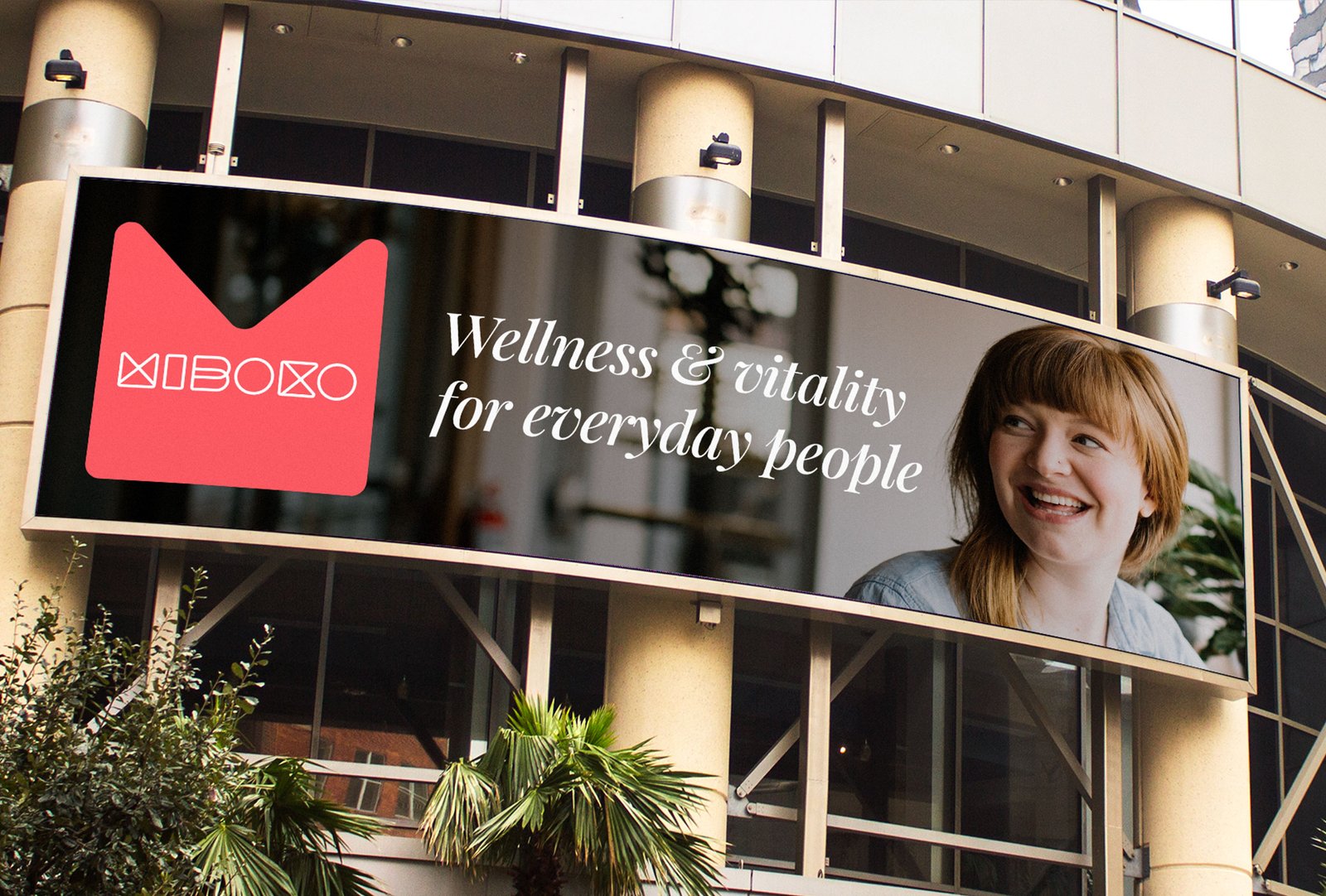
When doing less becomes so much more

AlMashtal

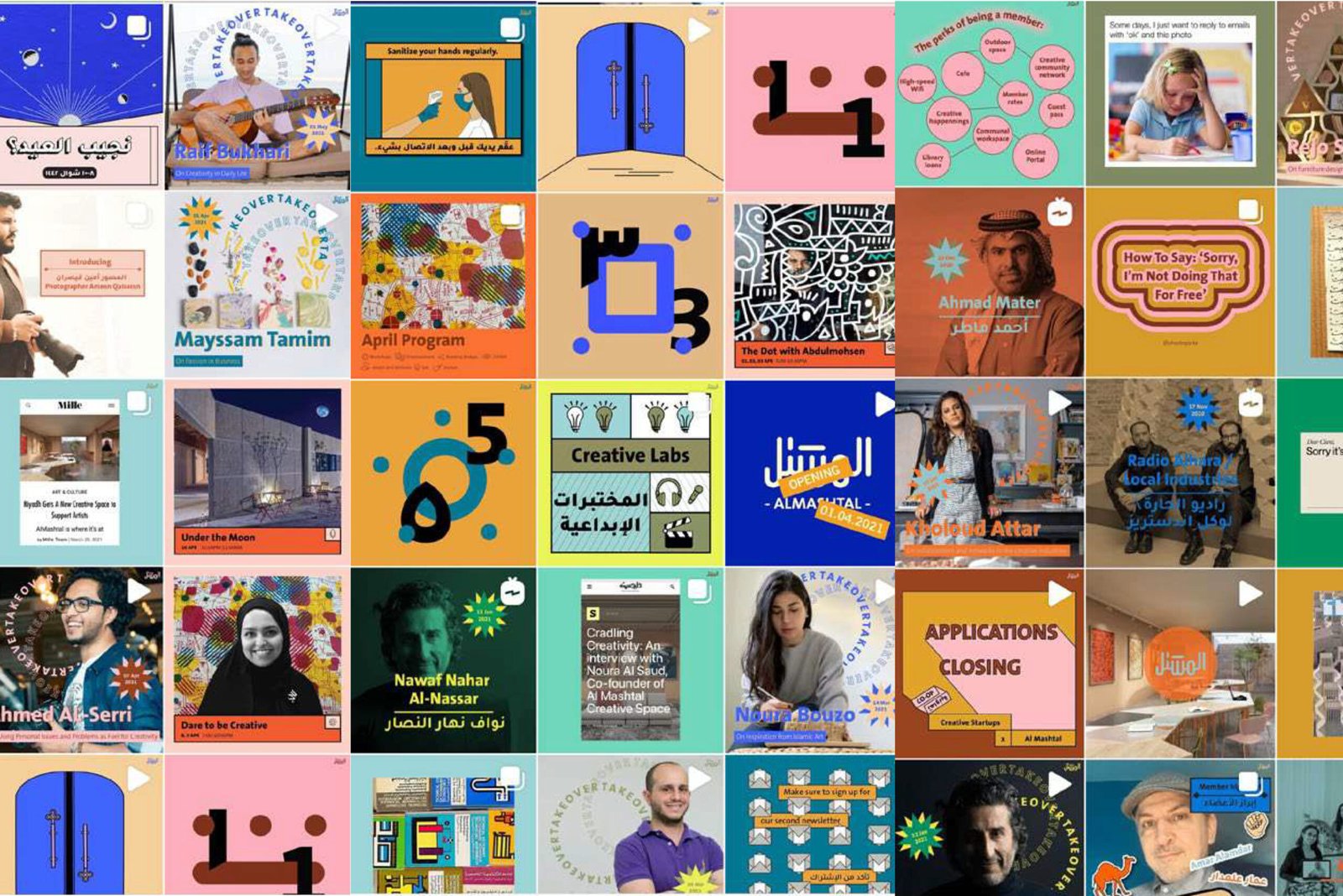
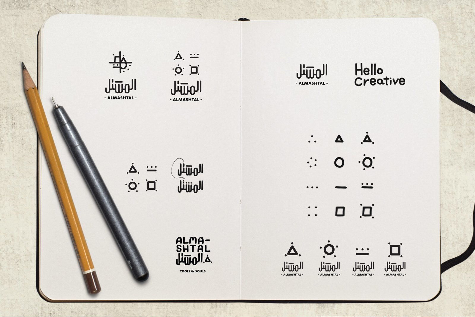
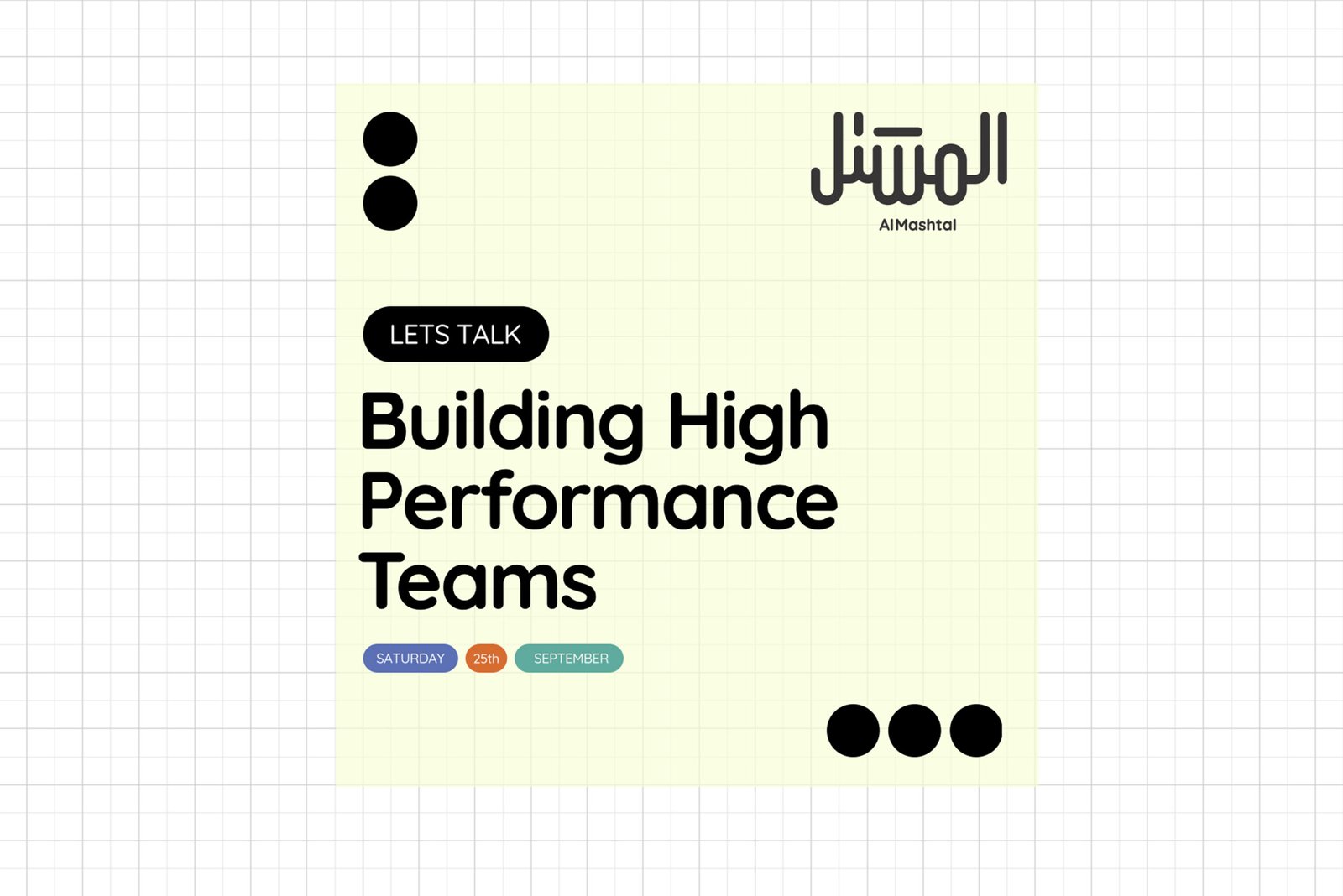
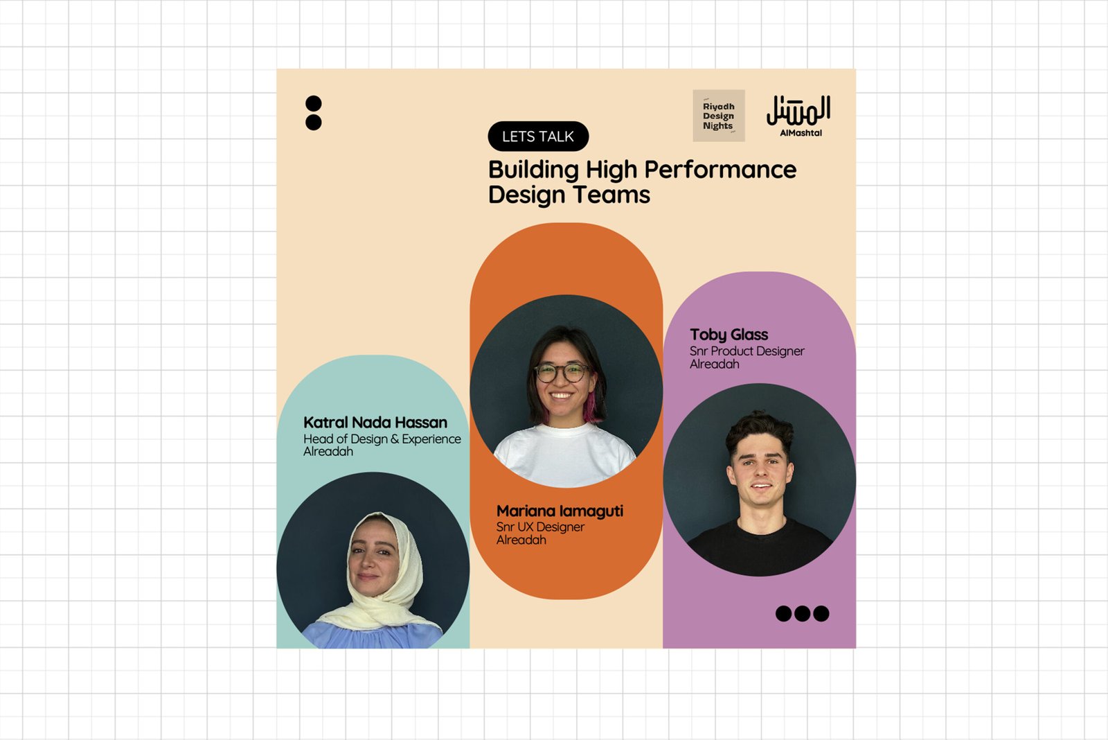
Brand & Experience Design

Creative muscle

Like any good enterprise that champions imagination, inventiveness, and creativity, AlMashtal are conscious of their brand image.

More importantly, they were keen to allow their designers and content creators the freedom to flex their creative muscles.

However, as they discovered, that doesn't always lead to the accurate portrayal of the brand.

"Whilst we like to encourage creative exploration, we found that too much gave our brand a sense of incoherence"

I was invited by HRH Princess Noura Al Saud, the founder of AlMashtal, to come in a guide her team towards a more structured brand and visual identity.

She stressed that what she was looking for was less of a rebrand, and more of a refresh - to keep the core components of the identity intact, but make them more harmonious and orderly.

Above all AlMashtal need a consistent look and feel across all its brand applications.

After an audit of all the brand identity assets, I started with a review of the logo.

I hadn't intended to make any changes to the logo, however something about it bothered me.

In my review and analysis, it became apparent that the English text in the logo was slightly off-centre, and as the Arabic text was more elaborate on one side than the other, it mean't that on closer inspection, the logo seemed to be more emphasised on one side.

I also wanted to bring better parity between the typographic styles of the two languages in the logotype.

The Arabic is a beautiful, organic custom script; the English in contrast is much more angular and geometric. I revised the English to make it rounded - more subtle and more consistent with the primary Arabic.

Looking further at how I might harmonise the visual language, I went back to the original AlMashtal brand book and used it as a stepping stone to further enhance and bring clarity, coherence, and consistency to the identity design.

I drew upon the theme of dots and dashes to create a visual language based on morse code to provide a style that is grounded and meaningful.

This new 'visual language' provided the graphical framework that allowed me to bring structure and organisation to the identity design.

I developed a styleguide that enabled AlMashtal's designers and content creators to maintain the ability to express the brand creatively, but in a far more systematic and consistent way.

I homogenised the colour palette and typographic system, making asset creation far more manageable and intuitive, created a 'stamp' to ensure rapid familiarity with brand communications, and introduced 'graphical focal points' into the design system to elevate the design and draw attention to specific messages.

The result

The new identity is a natural evolution for the brand, retaining much of its roots whilst giving it a much-needed injection of energy and structure.

The feedback from the AlMashtal team has been overwhelmingly positive; the new design is a better reflection of the brand, and it's much easier for content creators to build assets that maintain the visual style without sacrificing creativity.

More projects.

About.

Works.

Let's Connect!